GUI tests: resizeToFit / adaptToChildren

https://www.babylonjs-playground.com/#AMYR5C#24

There’s a messy playground… where I am testing GUI textBlock.text changes… after a 5-second delay.

Both GUI rectangle… and scrollViewer… are tested.

There is a statement in the resizeToFit section of the GUI textBlock docs… that says…

Notice that textWrapping is ignored when resizeToFit is set to true. It doesn’t make sense logically for both properties to be used at the same time as they contradict each other.”

That MIGHT BE an incorrect claim. Lines 80 & 81 are being used together in the blue-background rectangle. You can NOP line 80 and then re-run, and wait 5 seconds… to see that wrapping is not ignored.

The same situation happens in lines 126 & 127 of the scrollViewer.

So, perhaps that docs line needs some adjusting.


Minor subject change:

Notice lines 40 & 41… adapt blue rect (container) width/height to children.

I thought this would be a fun place to experiment, too… as the textBlock is resizingToFIt after 5 seconds. The blue rect container will need to change, too… to re-adapt to the new textBlock width / height.

It does. It adapts… at least height-wise. No adapting needed on the width, as the word wrapper took care of that.

Interesting! Fun interplay between word-wrapping, and GUI textBlock resizes, and container size-adaptations. (at least i think so)


Need extra space around the text of the blue rectangle? You need to use NEGATIVE paddings on the rectangle... like seen in lines 58-61. Interesting. And, we get a new parody song from Wingnut, too! :)
I didn't know where to post this. We don't have a category to fit this. It's a test playground, open for discussions and experiments and learning. Join-in... tell us what you try/learn. Admin, move it, at-will... or delete, as needed.
1 Like

Well it works in that situation but you are lucky I would say. Both properties are kind on recursive in the sense that if you resizeToFit a text it will not wrap and vice and versa. In your case it is not possible to stretch more the container so it ends up closing the recursive call but it is an edge case

https://doc.babylonjs.com/how_to/scrollviewer

At the bottom…

However quite often you need to present text fitting the width of the viewing window and scrolling for the height. This is achieved by setting the textWrapping and reSizeToFit as follows

myTextBlock.textWrapping = BABYLON.GUI.TextWrapping.WordWrap;
myTextBlock.resizeToFit = true;

It’s even recommended, there. I wish the docs would make up its mind. :smiley: ScrollViewer is an odd control, though, I suspect.

Yes you are right :slight_smile: scrollViewer is a bit different for that particular reason. I;m not sure how to communicate that well in the doc

https://www.babylonjs-playground.com/#AMYR5C#25

A little simpler PG… with 5, 10, 15, and 20 sec timers… doing various things.

Can you show me any example of wordwrapping being ignored… when resizeToFit is true?

I’m not sure HOW to make it be ignored. If that is the case, perhaps remove the docs line? I dunno. Weird situation. :slight_smile: I understand the recursion possibilities… could be a fork fight. :slight_smile:

This all started… trying to make my flow chart diagram… survive a F12 dev-tools open/close. It doesn’t do so well in Firefox ESR. Got words on that? I’ll take 'em. I haven’t tried the idealSize stuff yet… which is recommended for canvas resizings. Still learning. Words welcome, from anyone.

Sometimes, it “feels like” containers should have 8 “connector points” surrounding them… and its real easy to hook lineControls across these container connector points, and the lines stay nicely connected no matter how we resize and no matter if we hit F12 or not. I want to try tasty diagrams for PBT’s.

Maybe I’ll try some “advanced line controls”… with arrow-heads and tail-feathers… flow charts. :slight_smile: Then try some animating. Maybe try to scale fontSizes when GUI scales (fontResizeToFit - tumor causer, me thinks). Technical illustrator torturing of BJS GUI.

hum this PG is just all black for me :frowning:

@Wingnut : Loved that first PG - used to hear that Riders in the Sky song when I was a little kid - Burl Ives - on a radio show called “Children’s Favorites”. Very popular was Burl Ives. Maybe the first song I can remember hearing.

As for the code - can you put textures into those GUis too ?

cheers, gryff :slight_smile:

1 Like

#17 or #25? Find reason? I am pretty good at scolding playgrounds until they start working. :slight_smile:

@sebavan built the 9-function resizing system… in thread https://forum.babylonjs.com/t/help-recover-my-gui-after-canvas-resize-plus-more . Complex, yet works pretty good, but F12 still trouble (until I drag the vertical canvas-editor divider a little bit. Then it fixes itself, dev tools open or not).

Some event not observed somewhere. All other browser window drag-resizings… seem fine. Still testing/learning.

Yeah, imageControls go into GUI containers just fine. You thinkin’ images for the arrows/lines?

Nah, you’re thinkin’ textures for backgrounds of the text, yes? I THINK that can be done. I can’t remember how, off the top of my head, though.

https://www.babylonjs-playground.com/#AMYR5C#16 is pretty gruesome, too. Sliding around the ADT rootContainer top/left… the lines don’t do so well. The green circle is an ellipse used to make one of the 90-degree turns in the lines. Perhaps not a wise method. The lower three 90-degree line-turns… seem to work better.

Animating diagrams is good for tutorials/teaching, but it’s rare that someone would animate the top and left of the ADT rootContainer. More often, children containers. StackPanels/Grids allowed WITHIN the “flown containers”, but not allowed to contain a flyer. Flying a control that is within a grid or stackPanel… is nearly against the law. heh.

Keeping the lines connected between the moved containers… needs to happen, to get good diagram animations and flow-chart branch-adjusting. Sort of like a printed circuit board layout and solder-tracks tool. Etchers-R-Us. :slight_smile:

I’ve wandered-off original topic. Keeping lines connected while animating .top and .left values (and during canvas resizes)… actually deserves another thread, cuz it’s a BIG topic by itself, I suspect.

@Wingnut wrote:

Yeah, imageControls go into GUI containers just fine. You thinkin’ images for the arrows/lines?

That and see image below:

Read the post and thought “could be an option

cheers, gryff :slight_smile:

2 Likes

Cool! You bet… imageOnlyButton… https://www.babylonjs-playground.com/#XCPP9Y#1112

Icons/symbols are SO international, too. I can foresee a time when, for example, the Babylon “engine” has an engine symbol. Scene is a tv screen. Lights, cameras, mesh, you know, no reason to translate button text… when we don’t use any. :slight_smile:

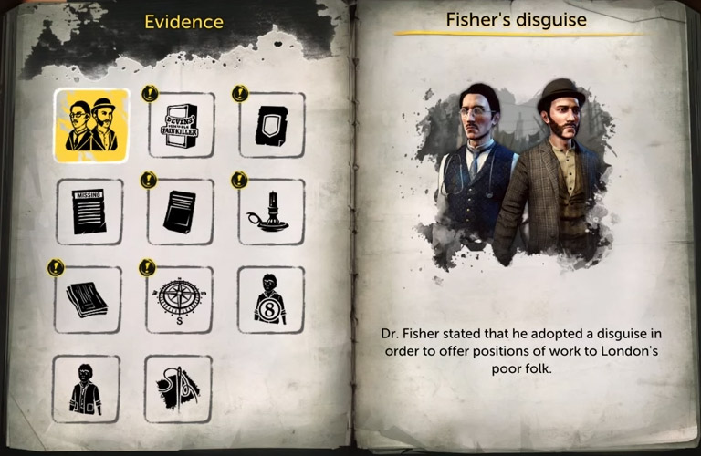
We could standardize all the BJS symbols, using them over and over again… from tutorial to tutorial, PBT to PBT, whatever. Just like that picture you included, Gryff. Sure, we need to translate the paragraph of text on the right, but never needing to translate left-side button labels… is a wonderful advantage/feature.

The consistent button sizes on the left page… is perfect for GUI stack panels (horz / vert arrays-of-controls). That is a single isVertical = true stackPanel, containing 4 isVertical = false stackPanels… each with 3-members.

Or to-heck-with the stackPanels, and use the more-modern GUI Grid control. Good application idea, G-man! Not one “Translated button-label doesn’t fit/wrap-correctly” -problem whatsoever.

Diamond shape: https://www.babylonjs-playground.com/#XCPP9Y#1113 Not sure how well such things “reside-within” stackPanel or grid cells, but I think it can be done. The actual image is button.children[0]… so we can rotate the button ONE way, and button.children[0] the OTHER way.

Let’s animate! With animated controls like this, and using certain pointer positions, we might notice that the pointer needs an onControlEnter (onControlUnder?) and onControlOut (onControlOutFromUnder?). :smiley: (Wingy being goofy).

But, IF the pointer were crosshairs… locked at screen-center, then it might be conceivable to use cursor keys to move-around a grid full of buttons… placing various buttons under the crosshair/reticle. In this case, button.onPointerEnter and onPointerOut… would NOT activate. Instead, ya need crosshair.onControlUnder and crosshair.onControlOutFromUnder. heh. Weird.

Or maybe… control.onMovedUnderPointer and control.onMovedFromUnderPointer ? hmm. :slight_smile:

Sorry for off-topic from OP.

1 Like

Sorry for off-topic from OP.

Well, that is not your fault Wingy. I sometimes read posts and my mind just goes, “what if …”, and so I post :slight_smile:

And as for icons - a place I use - free icons for your games. Icons come as .svg or png

But there I go, wandering again!

cheers, gryff :slight_smile:

1 Like

I like your experiments with GUI.

The simple answer is probably no. I think, like you, that wordwrapping and resizeToFit can work together provided the fontsize is OK for the width and the PG below shows this.

So I agree that the statement in the docs

is not correct. There is a contradiction as resizeToFit will adjust width to make words fit across and textWrapping adjusts the vertical position of words so no need to alter the width of the block. However in applying both the resizeToFit is ignored on width but not on height. It could be that there was an internal change to accommodate the scrollViewer actions that negated the statement above.

I will submit a PR.

In the following PG the text blocks are set up like this

block0 no wrap no resize                        block2 wrap only

block1 resize only                              block3 wrap and resize

0 size of block fixed; text on one line only
1 resize - adjusts width of block to make text fit and height adjusted for font height
2 wrap - size of block fixed; text spread vertically
3 wrap and resize - adjusts height of block with vertical spread of text

Timed sequence in PG goes add text; increase font size, further increase font size, add more text; decrease fontsize. If I remember correctly the scrollviewer has an internal mechanism to deal with font size changes.

1 Like

:slight_smile: Hi, and thx G… but I started drifting away from topic… before you even posted. heh. Maybe I’m gun-shy.

Hi John, thx for info and good tests. It would be nice if textBlocks had a border or background color OF THEIR OWN, because I think SOME people could “assume” that textBlock.resizeToFit… is a resizeToFit into the textBlock’s container control (a different control).

It’s not so. I think tb’s resizeToFit is actually fitting the text to a simulated container-area on the textBlock control itself. [Source]

TextBlocks have no children, although maybe they GET some children when they go multi-line (wordwrapped). I haven’t tested that.

I think… as long as we keep lines 35/36 adapt-To-Children commands ON the rect container, then the rect’s border-line IS showing us the actual size of the textBlock “simu-container area”. According to the context2d fillText spec, text never has its own background color or border. It is hard-wired to have a transparent background.

We’re doing these tests correctly, always keeping our adapt lines active. Still, it would be cool to remove the rects, and still see the edges of the actual textBlock’s simu-container area. Then we could eliminate all rects from these tests, and we might be able to understand textBlock’s resizeToFit a bit better/clearer.

Have I over-stated this to death, yet? It’s just that… resizeToFit is a term that can be confusing… because it doesn’t tell WHAT it is resizing to fit. Text clipping/overflow might also suffer from this potential confusion. Did the text get clipped/overflowed from its simu-container fillText area, or from a GUI container-control that the textBlock is a member-of?

Right now, the quickest way to a bordered textBlock… is creating a labeled button, and then set button.isHitTestVisible = false; [pg]. (de-activate pointer events) :slight_smile: Notice the auto-word-wrapping on the simpleButton in that pg? Easy as pie.

It’s easy for us to dream-up these advanced features, but without being the coder of the GUI system, it is difficult for us to see all the potential roadblocks/hassles.

I wonder if highlighting/copying textBlock text is “on-the-horizon”. Context2d spec doesn’t mention it. It’s likely one of those future features that NOBODY wants to talk or think about. :slight_smile: Same with using control-mousewheel to scale the font-size of textBlocks (when the textBlock is focused-upon). I don’t know if we will EVER see that feature, but older people (and perhaps mobile users) NEED it… to make the text easier to read. We probably need .isHighlightable and .isCopyable flags. Tough coding.

Sorry for TMI… guys. Thx for tests, ideas, and comments. Keep ‘em comin’.

Hi Gang. I have some experiments happening here: https://playground.babylonjs.com/#4PLF3P#6

First, notice lines 30-31… we’ve told rect1 to adapt to the size of its children… both axes. Doing this, makes the text overflow into the orange thickness border. Although annoying, that is probably the correct functionality for both “adaptations”.

Now activate lines 25-28… let’s get some negative paddings set… and RUN again.

Ahh, much better, eh? Now our text has some room to breathe. :slight_smile: But, negative paddings? That doesn’t feel right, does it? We really need the text to have a margin (like HTML boxModels)… but that’s not available, and is a headache for GUI-system programmers, I think.

De-activate lines 25-28, and notice lines 35-47, an experimental function I invented. Activate line 64 to call it. The value in the parameter… is the amount of text pixel-distance FROM the orange border. The rect1.thickness is automatically compensated-for.

Not bad, eh? No user-set negative paddings needed… which I like. I’m a bit worried that it COULD be called BEFORE the GUI system has done its needed measuring, but in this example, it seems to be working fine.

I don’t know if container.expandMargin() would be useful for core, and I cannot foresee/foretell the problems and ramifications of installing it… into the BJS Container-class controls. But, maybe it is a tolerable idea.

Would somecontrol.expandPadding() be useful, too? It would be a way to set 2-4 paddings, all in one call. .expandMargin and .expandPadding might each need TWO parameters, one for left/right and a second for top/bottom. Maybe they would be called setMargin and setPadding, and accept negative numbers (oh no, not THOSE again). Spacing helpers. Gap managers. :slight_smile: Especially useful for those who use rounded corners.

When calling methods to set INITIAL GUI values… it is wise to call them from within a adt.onBeforeFirstRender handler, perhaps? (when adt.texture.isReady() goes true) Dumb idea? Calling methods… AFTER adt construction… but BEFORE its first-time render (and never again)… is a weird thing, I suppose. Bad design, perhaps. After our custom-func call, adt would need .isDirty set true, and (likely) need a complete re-measuring of entire flow/layout. Maybe better to consider these user-adjusted spacings… DURING the child-addings… WAY before adt.isReady.

Grids and stackPanels… I don’t think these methods would apply to those. Mostly… just bordered containers, I guess. (my brain is starting to hurt, though) :slight_smile: I wonder where would we be… if textblocks allowed thickness… and a background color and border color apart from text color. In many cases, folks ONLY use rect-containers… for bordering and backgrounding textBlocks.

How 'bout a new “impure” combo-control… the rectTextBlock… a rectangle-contained textblock… with lots of spacing and bordering power, AND easy color or TEXTURED backgrounds! Even video backgrounds and RTT’s and other animated stuff! WOW! (drool). ANYwaaaaaaay…

Let’s hear from you guys/gals. Know things about this? See far-reaching impact problems? Do others have concerns about the use of negative paddings? Other work-arounds? Got more test playgrounds? Any other thoughts? (thx)

https://www.babylonjs-playground.com/#PF5SYT#18 Wingy goofing around with a simpleButton atop an imageOnlyButton (which has isHitTestVisible = false). Textured background, with border, with text, good fun. I still need two controls to do it, darn it. Hmm. Gruesome scaling work in lines 29-31 area, too. Image overflows when ADT does vertical resize (like when opening f12 dev tools window). It does MUCH better when lines 29-31 are set like this.

https://www.babylonjs-playground.com/#1AVEYO#55

Happy Codependence Day, USA! errr… somethin’. :slight_smile:

3 Likes