Yes, I did, but he still made a mistake。。。

Not really a mistake, I have some debug code, so that on local, it fetches a random user instead of creating a new user each time but requires at least 1 user for it to work. I’ve updated the GITHUB code so it should work for you now too. Enjoy ![]()
This is crazy! It’s really great! But when I ran it locally and tried to get into the Dungeon (Level 2), I still couldn’t get in, but I could on t5c.onrender.com. What’s going on here

Thanks, It is a similar issue as previously. Until I improve it, just remove/comment the hightlighted code and everything will work as you want:
For any more help, please send me a private message, so as not to pollute this thread. Thanks
Items are looking better now with a hover and a label
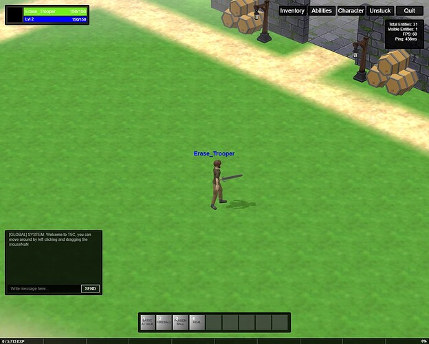
Preview of my upcoming UI. The current one is so terrible, I had to do something about it ![]()
I won’t comment the old one ![]() The new one already looks much better organized; Eventually now just missing this touch of ‘design’ and ‘identity’. But that’s the ez part (and the cherry on the cake for a simple designer like me-self
The new one already looks much better organized; Eventually now just missing this touch of ‘design’ and ‘identity’. But that’s the ez part (and the cherry on the cake for a simple designer like me-self ![]() GJ doing this revamp,
GJ doing this revamp, ![]()
Haha, yeah, not even worth speaking of the previous design, it’s litterally an eye sore ![]() Agreed, I just wanted to give a good base. Anyway thanks for the comment
Agreed, I just wanted to give a good base. Anyway thanks for the comment ![]()
Hi guys,
I finish the full refactoring of my UI, code and design.
Everything is way more tidy now and I’m rather proud of the result.
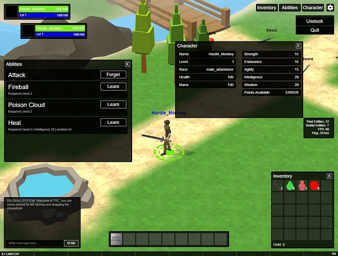
Full interface with all the panels (draggable)
Added a quick play (goes straight to the game for the impatients)
A video is worth 100 words ![]()
Everything is named in a more logical way

Looks cool. Love the draggable panels ![]() .
.
If I can allow myself, I would have one small comment.
It’s about the ‘inventory’, 'abilities, 'character… buttons placed above the deck.
I would have kept them elsewhere and slicker. In my opinion (and my opinion only), they impact the immersion and also, there’s a fair chance that you would eventually accidentally click or tap on’em when going towards the bottom.
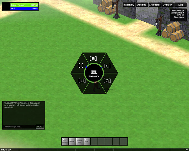
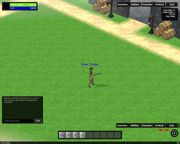
I also believe they could be just icons instead of text and hosted either in a small quarter of a circle or something or in a simple hamburger menu, to the far right top or bottom.
Again, my opinion only and my only comment. Else, GJ ![]() (and I mean it)
(and I mean it)
Yes, this is already much better in my opinion.
Now, It’s hard for me to give you even just my opinion on this. UI/UX is to be considered along with the game design, gameplay and an identity (for both design and gameplay).
All I can say is that (personally) I like when the interface does not all too much take over the game/scene view. Though, it all depends on the type of game and interactions. If it’s for management/strategy, eventually the panels and the ability to have an overview of all takes over the scene view. If it’s a diablo-like game (even in MMO) I like to have max visibility and immersion. Trying not to have it all too busy. In MMO, there’s already the console and the chat so there’s already more on the screen at all time. Means the rest should be limited as much as possible towards the interactions you won’t take at a same time. Typically, the quit button doesn’t have to be at first level (and eventually the ‘unstuck’ could also be part of a 2-steps interaction). And then, they don’t really belong to the character/game (like inventory, abilities or character stats). Means, they could be elsewhere.
Inventory, abilities and character (stats) is something you want to be able to access at all time. However, they also make a ‘pause’ in the game. While you are setting those you are not interacting with the scene at the same time. Eventually, depending on how it’s organized, you will want to have two panels open at the same time (reason why I like the draggable panels). May be you want to have your inventory and character stats open because choosing from the inventory changes your stats. But, by any means, when you call one of these, you are switching from the real-time game interaction to a ‘planning phase’. Which means that the buttons don’t need to be all accessible from a one click (although it’s appreciable on desktop to have a kb to open these panels). But, through click or tap (if mobile) you could use a button that folds/unfolds these. As I said, a hamburger menu or a wheel menu.
There are many options for this (as you probably know). I can’t really tell you which one I like most. It’s an overal thing and like any UI there’s a time needed to adapt to it. It’s only after a few hours of game that you can tell whether the overal experience is good or somewhat frustrating.
Here a few rushes (apologies for the absence of design - these are really just to illustrate my point, quickly drafted in 10 min). It’s just to show some of the options most found in games (at least the games I play ![]() . Might give you some ideas. As I said, there are other options.
. Might give you some ideas. As I said, there are other options.
I just have to say I absolutely love coming back to this thread and seeing you constantly evolving and refining this project, it’s SO SO SO cool to see!
I appreciate you saying that @carolhmj thanks to all you guys for your input and help ![]()
Thanks @mawa Lots of good point there and food for thoughts there. ![]()
Demo is working again, didnt realize it was broken ![]()
I’m getting Final Fantasy vibes here ![]() (Had to share this, haha)
(Had to share this, haha)
ahah Keep it as a “god mode” secret feature
Might be just a tiny little bit too much no? or is it just me? ![]()
![]()
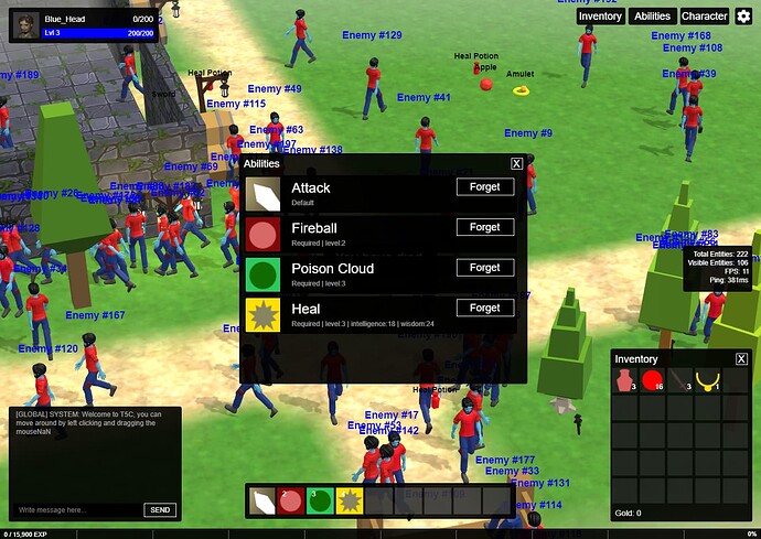
UI updates
UI is improving, added dropdown for the less important buttons as suggested by @mawa
And started working on showing player stats.
Improved AI
On the side, been working on improving the AI and make it more versatile and easier to add features on. ( it’s a hard thing to showcase ![]() )
)
NB: still in dev, but just to give the idea:
Main AI loop
// runs on every server iteration
update() {
    // if does not have a target, keep monitoring the closest player
    if (this.AI_TARGET === null || this.AI_TARGET === undefined) {
        console.log("SEARCHING FOR CLOSEST PLAYER", this.AI_CLOSEST_PLAYER_DISTANCE);
        this.findClosestPlayer();
    }

    // if entity has a target, monitor it's position
    if (this.AI_TARGET != null && this.AI_TARGET !== undefined) {
        console.log("MONITORING TARGET POSITION", this.AI_TARGET.x, this.AI_TARGET.z);
        this.monitorTarget();
    }

    // Update the FSM controlling the "brain". It will invoke the currently active state function
    this.brain.update();
}
Simple AI state manager
export default class FSM {
    private activeState: Function; // points to the currently active state function

    constructor() {}

    public setState(state, context): void {
        this.activeState = state.bind(context);
        console.log("SET STATE", state);
    }

    public update(): void {
        if (this.activeState) {
            this.activeState();
        }
    }
}
Example of patrolling state
patrolling() {
    // if there is a closest player, and in aggro range
    if (this.AI_CLOSEST_PLAYER_DISTANCE != null && this.AI_CLOSEST_PLAYER_DISTANCE < Config.MONSTER_ATTACK_DISTANCE) {
        console.log("FOUND CLOSEST PLAYER");
        this.AI_TARGET = this.AI_CLOSEST_PLAYER;

        // reset closest player to null and
        this.AI_CLOSEST_PLAYER = null;
        this.AI_CLOSEST_PLAYER_DISTANCE = null;
    }

    // if entity has a target, start searching for it
    if (this.AI_TARGET && this.AI_TARGET.sessionId) {
        console.log("START CHASING", this.AI_TARGET.sessionId);
        this.brain.setState(this.searching, this);
    }

    // if entity does not have a destination, find one
    if (!this.AI_NAV_TARGET) {
        this.setRandomDestination(this.getPosition());
    }

    // else just continue patrolling
    console.log("AI IS PATROLLING", this.AI_CLOSEST_PLAYER);
    this.moveTowards();
}


