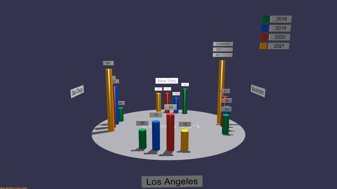
Anybody got an idea for a name for this new 3D chart type? For now it’s called the Stonehenge.
The video is an example of using back side and front sides of a plane shape. The labels in the front are front side only and placed beneath the ground to not obstruct the chart. The labels behind the chart are back side only and placed above the ground. The nice feature of the difference between sides is that the labels automatically disappear/appear when the camera is moving around the scene.
Also, the amazing billboard mode. All the labels in the chart are auto-rotated to always face the camera, with one line of code! (setting the billboard mode of the shape) - BJS rocks!
The Stonehenge is available in three variants (standard, stacked and animated over time).
http://www.3d-decks.com
#web3d
#animation
#bjs
#bjornsplayground
#babylonjs
#3ddecks
#presentationdesign
8 Likes
@jelster , awesome suggestion, thanks.
1 Like
Oooohh just had another idea regarding the shadows and light — for time-series data, you could key an animation that moves the “sun” across the sky to match the chronology of the data, to give a subtle visual cue to users that the data is through time
Ed: coincidentally, this showed up in the ray tracing thread just now!
https://forum.babylonjs.com/t/path-tracing-in-babylonjs/11475/99?u=jelster
1 Like
@jelster, gave your idea a shot with a new built-in chart style “Stonehenge (with a sun)”…
2 Likes
I personally have found 3D info graphics to be a dead end really. It will never be a thing simply because of practical functionality. You cant beat 2D in this regard. 3D is great but not great for everything. There might be some edge case scenarios , maybe more as a animation probably but definitely not as interactive.
No hard feelings , just my personal experience. I love 3D, just not 3D info graphics. Most clients wont care for it either.
Love the effect! I like how it makes it more clear what series is being highlighted - speaking of highlighting, would adding a small amount of emissive to the labels help with readability?
@jelster, thanks. I’ll try the emissive. Can you point to a Playground example using this trick?
One approach would be I think you’d to switch to using the MeshWriter extension, which creates an SPS with a particle for each charater; with access to the material you can set an emissive texture. PG
Another approach you might consider is using the AdvancedDynamicTexture as a mesh texture and assigning it as an emissivity texture mask - I put together this quick PG to demonstrate.
HTH!
3 Likes
@jelster , thanks!. I will look into this asap. —bjorn


