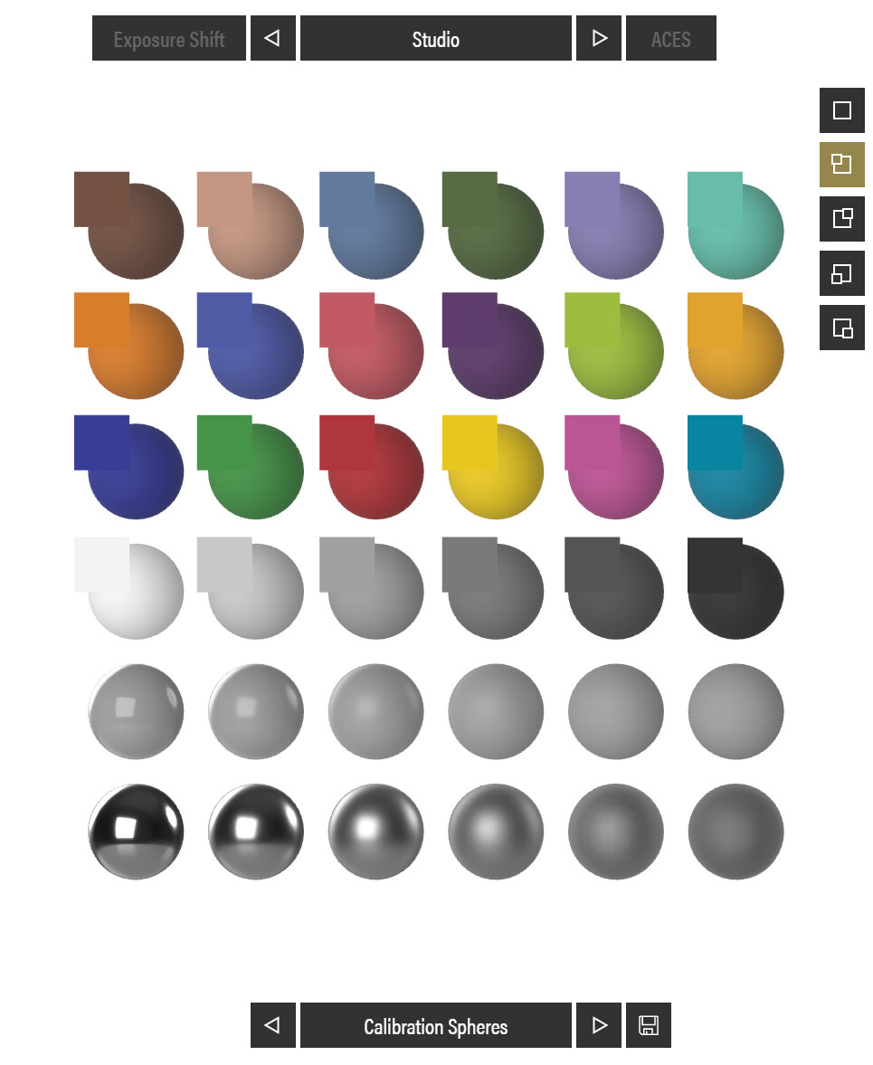
@val, I would definitely take a look at your lighting setup, if you are trying to match your base color, especially on flat surfaces like cabinet doors, it is mostly about the lighting setup. Here is a sample PG that I have been using to demonstrate this:
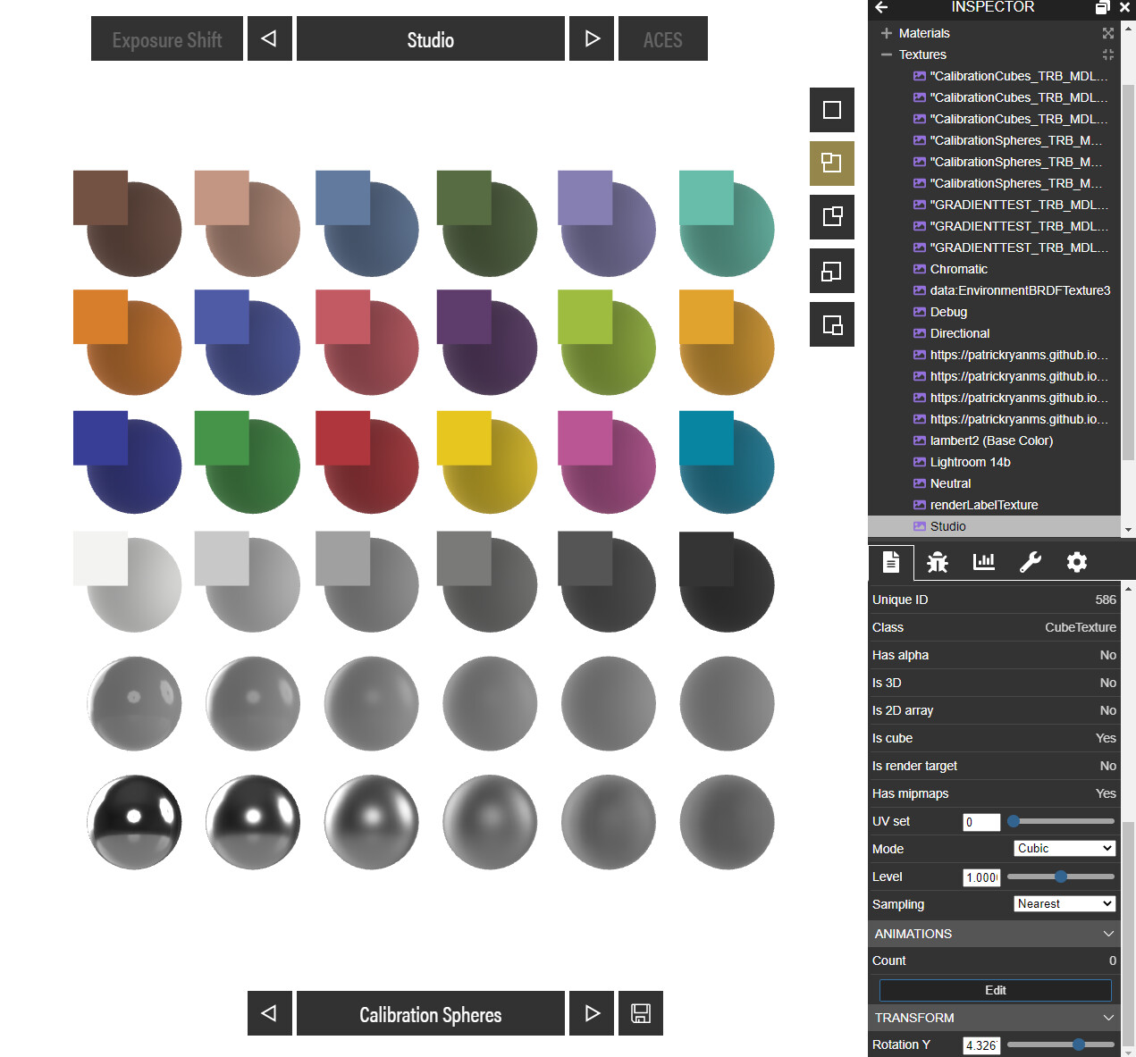
You can see in both of these images that you have a chip in the upper left of each colored sphere/cube which is an emissive texture of the base color applied to the mesh. This has no lighting information on it so it is a faithful representation of the base color texture. The reason it matches the color in the mesh, which is lit, has to do with the angle and quality of the light in the environment. We are using large area lights and the rotation gives us the most faithful representation of the base color.
However, if you go into the environment texture and rotate the environment, you will see we deviate from the color quite a bit:
It also stands to reason that if you have an environment that is too dark like this one you will also have a shift:
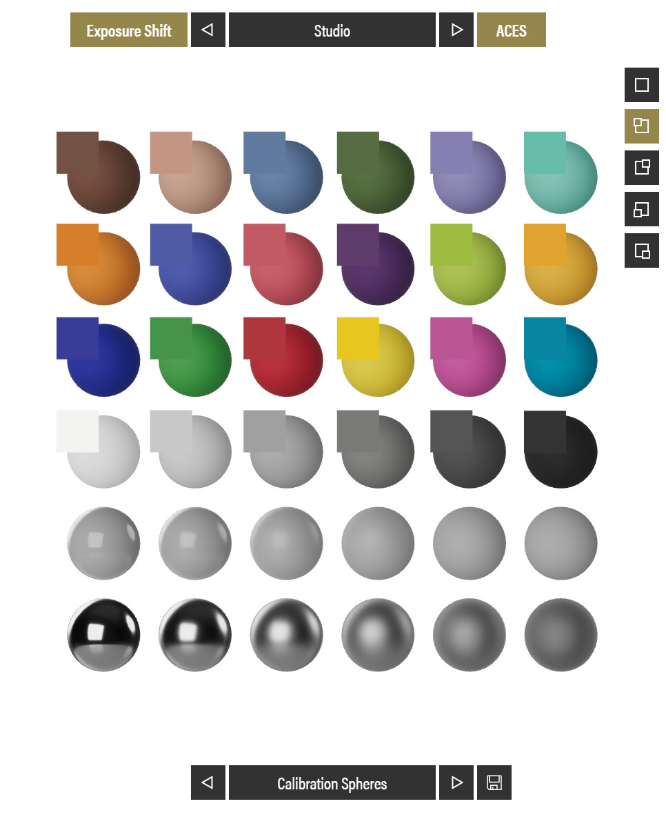
This is the same for one that is too bright as well. You also need to consider tone mapping which can also make a difference. This version is enabling ACES tone mapping, but also an exposure adjustment to compensate for the fact that the ACES curve was developed to be seen on a bright screen in a dark room:
All of these elements play a role in matching the final render of your scene to the input color. Lighting will certainly always play a role in the final color output, otherwise we would just set all materials to unlit and skip lighting calculations all together, but this would not feel realistic as no surface is so evenly lit that it only shows the material pigment color with no specular reflections or shadow contributions.
The trick here is to balance the light in your scene to make your materials feel as they should which includes placement, size and intensity, even if you are talking about an IBL. This IBL was authored in Maya and rendered out to give a specific look with the positions, size, and intensity of each light contributing to the final look:
I would look at your light placement (if you are using punctual lights) as well as the rotation of your environment. It may also be beneficial to author an HDRI that gives your products the best overall look if you are rendering out a lot of similar types of products. Placement of lights in this case should be higher so that we get more of a downlight render with some bounce which will look more natural as this is what we are used to seeing in real life.